15.10.12

Evaluation


Evaluation
I have most of the conventions I found while doing my research, to make the, magazine look more like an original magazine. I put the masthead in big letters at the top to make it instantly recognisable and let the audience know what the magazine is called. I also put the sky line at the top like in most of the magazines I have researched. I made each of the stories mentioned in the sky line a different colour to make each look different from the one before and the alternating colours used suits the colour scheme while also standing out form the rest of the cover. I have tried to use a medium close up o fit in with the conventions of a magazine cover but I think the image is more of a medium shot which lets the reader see the full person.
I have used the chosen colour because the colour green connotates the idea of prosperity and freshness which I feel will attract the correct audience. And the colour yellow connotates the idea of happiness and joy which is what I wanted because it wanted the magazine to be a light hearted one and feel less serious which it think will attract the key target audience because the magazine is aimed at people in their late teens and I feel that this target market will prefer a light hearted magazine to a serious and dull one.  I have also made the model hold some college folders to connotate the idea of this lifestyle being educational while the fact she is wearing casual clothes shows that the lifestyle is also casual. I think that this will attract the target audience because the people in the target audience will want and desire this lifestyle. Also, the use of stories that relate to the reader will attract the correct target audience because they will want to know how it will affect them or how they feel about it.
I have asked some people what they think about the magazine, they are in my target audience.
“It looks so interesting and I want to read the actual magazine”- Josh Burnett
“It looks informative”-Jack Bell
I think I would have to do a wider assessment of the target audience to see whether it is effective but the preliminary results show it to be good.
Using the technology has made me learn how to use Photoshop effectively and has let me see the capabilities of the technology.
I believe this cover is slightly effective because the image looks like it will meet the target audience because of the colour scheme and the use of a splatter style background to make the image look more rugged and less serious which will attract the target audience. Also, I believe that it meets most of the conventions whilst also creating some of the necessary media language to attract the target audience effectively. However I feel that the image I have used looks to sharp and the edges need to be smoother to make it look more professional.

Final Magazine Cover


14.10.12

Original images 2


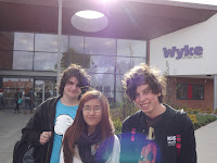
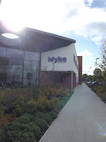
In most of these images i tried to get a medium shot or medium close up to meet the conventions of a magazine cover. I chose the location in some of the images to get the logo of the college in the background and to show some of the scenery, i think this will relate to the college theme of the magazine and show some of the college's features.Like in the other images, I made the people in the images wear casual clothes and also have books or folders in their hands to say that college life is casual but also educational at the same time. 

Original Images 1


In the bottom images i tried to get some long shots of the college and set up some establishing shots so the cover could showcase some of the colleges locations on the front cover. In the top to I tried to get some medium shots and medium close ups to meet the conventions of a magazine cover. I tried to get some of the college in the background as well so it will fit in with the college theme. Also, I told her to hold some college folders while also dressing casually to connotate the idea of college life being casual and educational at the same time to attract the audience into the lifestyle.

Magazine Cover initial idea


This is a draft/ initial idea for my final piece. I used the conventions used in other magazines and tried to muse the right colours and image to create the same connotations as a professional piece  Also, think I will use some more pull quotes and feature stories to attract an audience and leave less empty space, making the piece look less vacant.

Magazine cover layout

This is the plan for the layout of a magazine front cover, using the conventions from the various examples I have seen in my research. 

Contents page layout

This is a plan for the layout of a contents page using the conventions I have noticed in the research

Magazine example and analysis


This cover uses a two-tone style for the images which has the connotations of being “urban” and it has a similar feel to banksy image which makes the images look more rebellious. The mast head is a similar colour and the same shape in each issue of the magazine which can make readers instantly recognise which magazine it is. The colour of the text changes in each issue to make each cover different and unique, it also make the masthead fit in with the colour scheme used on the cover.

The target audience for this magazine is people who are in college or other forms of education. This audience is effectively attracted because the colour scheme makes the image look more attractive and will grab attention while also suiting the target audience because the way the colours are “splashed” all over the page, makes the image look like a messy piece of graffiti (sort of). 

The text connotates a sense of importance because all the letters are in capital letters and stand out more, making them seem more important. Also, the way the text in the centre tilts, makes this text seem more important than the others because it stands out from the straight angled title.

The images used in the cover show people having lots of fun. This gives connotations of the activities the magazine is advertising being fun and makes the audience like and want that sort of experience, making them want to know more and therefore read the magazine.

This magazine is therefore effective because it attracts the target audience and makes someone want to read the magazine through the ideas commutated through visual and media language.

11.10.12

Framing

This post is about the different types of framing available and whether they can be used in college magazine


Extreme Close up


This is used to draw emphasis to a specific point or in the case above; emotion/face. These make the viewer see the intended amount of detail in an image.

Close up


This is used for mainly the same reason as an Extreme Close up but it doesn't  create as much emphasis doesn't draw as much attention as the extreme close up.

Medium Close up


Medium close up shot shows someone from the chest up and is the most used type of framing in a college magazine.

Medium Shot


The Medium shot is of a person from the waist up. This is used to show a persons stature and is sometimes used in a college magazine.

Medium Long shot


This is a picture of someone from the legs up and is rarely used in a college magazine but it is sometimes.

Long Shot


This is used as an establishing shot to show the scene or show a landscape and is used in college magazines to show parts of a college.

Moodboard


This is a moodboard about college magazines and college life in general including examples of college magazines

5.10.12

Double Page Spread Conventions

This image is about the general conventions of a double page spread of a magazine

Double Page Spread Analysis

This image is analysing a double page spread of a magazine about Sesame Street and its effect on education throughout its history. Using bright colours and childish characters this article effectivly targets a young audince but it is meant for a different one, possible an older teen in college so this article doesnt really target the audinece effectivly. But, these bright colours would make this article really stand out from the rest of the magazine, therfore attracting a reader. The happy faces and the bright contrasting colours make the reader immediatly know that this is a happy article and not a serious high-brow one. This is also acheived because of the text, before the audience even read it, the flowing effetc makes it look childlike and fun, creating a connatation of happiness and a quirky feel.

4.10.12

Conventions Analysis

This image is about the conventions of a front cover and a brief evaluation of whether they are used effectively on this front cover, based on Media Language, Ideology, Institution, Audience and Representation (LIIAR).

Language
The image used on the front cover shows the model in a casual set of clothes. This connotates the idea of the college being relaxed and and casual because they le him wear those clothes  Also, the fact that he is holding educational books as well as being dressed casually connotates the idea of the college or the student having a casual atmosphere but also being very educational at the same time.

Institution
The cover is made by someone trying to make an informative piece about colleges and the local info involving local stories and general education stories. The front cover effectively shows the same conventions of stories made by this sort of institution so it is easily recognised.

Ideology
The main image is made to look like someone who would go to college and be successful so it connotates the idea of him being and "ideal" student and person. This will attract the audience effectively. Also, the image is made to look like a stereotypical student so the audience can recognise he is a student and understand what the magazine is about.


Audience
The image on the front is of someone is will appeal to the target audience of the magazine because the model is around the same age as the reader or is made to look like it. Also, the secondary colours used in the titles and the masthead; make the cover look more professional and more "grown up" because if the colours were mainly primary, it would connotate a childish theme and if tertiary colours were used the image would look miserable so the correct audience would not be attracted and wouldn't buy the magazine.

Representation
The colour green used in the Masthead connotates the ideology of the prosperity and "freshness". This makes the cover show the college look more "prosperous" and successful. This makes the college and the college lifestyle as a whole, look better and look more attractive.

Conventions of a Front cover

1.10.12

Conventions of a magazine


10 Conventions of a Magazine cover

- Masthead at top
- Barcode bottom left
- Picture of main article star
- Setting line
- Model credit
- Cover line
- Main cover Headline
- Date line
- Close up/ Medium Close up
- Feature stories and Pull Quotes