19.1.13
18.1.13

Content page LIIAR analysis 1

Language - red colour used has connotations of being passionate about something (in this case music) this suits the interests of the audience because if they are reading Q magazine they are obviously like music and the higher quality over higher popularity. The use of the large image of the courteeners shows that the interview would be in the readers interest and it shows that it is one of the main interviews / articles.
Ideology - Q magazine has an ideology where quality is important rather than popularity. An example of this being shown is the white background which has connotations of being pure and good, this makes the articles inside the magazine seem like they are of a higher quality and are respectable.
Institution - Q magazine is well known for being a respected music magazine as it has shown to value the quality of the music instead of the popularity of it, gaining the respect of the industry. This means that the audience has expectations of the reviews and the interviews being in-depth and trustworthy.
Audience - The main demographic for this audience would mainly be young middle class adults because the music is aimed at a younger adult audience and the higher price means that mostly the middle class would be able to afford it, although teenagers and people in the working class also by it. This means the page must appeal to a wide audience which shows because of the sophisticated looking structure and colours but the bright red contrasting the background will attract the younger audience as well.
Representation - The smooth and structured design used represents this magazine as being sophisticated and respectable which suits the magazines image as being a respected music magazine
17.1.13
Contents page Comparison


These are 3 examples of music magazine
contents pages. They all follow the same conventions of a contents page. The
main article is given a larger picture to attract the appropriate audience,
also the have the pull quotes and feature stories in bold to make them stand
out on the page and attract the reader. The same colour scheme is used as well
with the white background making the rest of the pages stand out in comparison.
The red is also used in all the pages, this is used to represent the feeling of
passion and a rebellious nature which fits with the audiences expectations of
ideology behind the magazine. However, the two pages from Q magazine are quite
different from the one from NME. The NME page is much more crowded and
scattered with the feature stories having large headlines which standout and
are very noticeable. This means that the magazine will achieve in attracting
the correct demographic because the magazine is seen as a more rebellious and
rocky magazine which isn’t as serious as Q but it is still a respected name in
music so the structure is still organised and ‘boxy’ which has connotations of
professionalism. The two pages from Q have much more space between each story,
this has connotations of professionalism and makes the page look sophisticated
which suits the image the magazine as a brand because it is seen as a
professional and serious music magazine that is very respectable where the
magazines opinion is well respected as a review for example.
4.1.13
Front cover draft 4

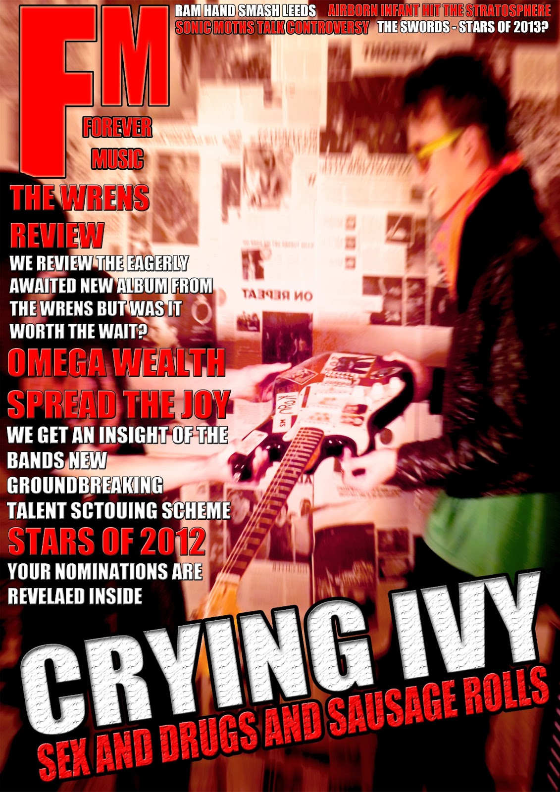
This is the fourth draft i made for my front cover of my music magazine. i believe it id the most visually appealing bit i doesn't really suit the style of magazine my key demographic is interested in. I think the use of glowing text for the main headline make the band look like a K-pop band from a anime comic. However i think the text used for the other pull quotes and feature stories suits the audiences interests because it is in a type-writer format which has connotations of being dirty and rebelliousness which i believe will attract the right audience. The image is a striking image that uses bright bold colours to attract attention. The more dominant red colour in the models hair has connotations of passion and it matches the texts colour which shows the two are related. The use of red has made the image vibrant and bold that contrasts the white background, this has connotations of being anything but innocent and being mischievous, which again targets the correct audience. However i think the positioning of the pull quotes and feature stories is wrong because they look like a list just written on the cover and they don't really match the style of the cover; the same happens with the masthead because it suits the main headline but the rest of the cover doesn't match it which causes it to stick out a bit. This is both a good and bad thing because it means the masthead is instantly spotted and recognized but it also breaks the theme of the cover, making t look unprofessional.
Front cover draft 3

This is the third draft of my front cover. I believe that this is not an effective magazine cover because it lacks enough substance and codes to attract any audience. This is because of the amount of empty space that makes the image look unfinished. However the use of many conventions makes the text of the image look professional as it suits the genre of music and the preferences of the key demographic. For example the sky line at the top and the similar style at the bottom suit the cover well and have connotations of being passionate about music and being fresh and up to date with the music industry. And the use of the bar-code, date and issue info make it seem professional and more realistic but this is let down by the lack of substance in the image. The picture that is showing cloudy dolls looks like it has just fallen onto the page and has been left there as it landed and has no purpose for being there, this makes it seem out of place and doesn't really suit the rest of the cover.
Front cover draft 2
This is the second draft of my front cover. I believe that certain aspects of the magazine are effective while others let it down significantly. The text is much more successful in this draft than the previous one because it stands out a lot more and has a much more consistent theme throughout and the connotations shown through the colours attracts the correct audience as it shows the right themes with the red having connotations of passion and the white having connotations of being fresh and cool, which i believe will successfully attract the key demographic of teenagers and young adults. as it suits what they are interested in. Also the logo and slogan is relevant to the magazine and the music it represents, it could be improved by adjusting the positioning of the slogan underneath so it lines up a bit better to make it look much more streamline and suit the logo that surrounds it. Also the colour could be changed or it could be put on a black background so it stands out from the background and other text, this will make the red logo become separated from the dominant red in the background which will make the logo more noticeable because at the moment it is a bit overwhelmed by the other features on the cover and doesn't stand out or look like the covers identity. However the background image is not effective at all as it, with help from poor positioning of the text, puts all the focus on an empty space and the two models in the image look bland and don't really seem relevant to the magazine. I don't think that the image is effective to use on the final piece because it looks amateur and unprofessional which isn't helped by the lack of basic conventions like having the headline in the middle or having a bar-code or date on it. This makes the image look more like a poster. However the use of a skyline at the top and the use of feature stories and pull quotes attract people to reading the magazine by giving a sample as to what is in the magazine and attracting people who like the act involved.
Front Cover Draft 1

This is the first draft of my Front cover for my music magazine. I have tried to follow all the conventions and use he right codes to make this an effective and professional looking cover but i do not feel that it is a successful first attempt. The conventions i have followed do make this cover look like a real cover like the use of feature stories to attract readers and the key demographic by using band names to attract the audience who listen to them. Also i believe the background image is successful as it suits the style of magazine i wanted the cover to show it is because the dominant red colours have connotations of passion and love in this context for music. I think i will use this image when making the final design or somewhere in the magazine because i feel that it is very suited to the key demographic i am aiming for which is teenagers and young adults. However the lack a basic conventions such as the date make this draft look like a rushed mock up and not professional. Also the sizing of certain things on the page is wrong, for example the free t-shirt advert on the front is the same size as the logo, making the logo seem less dominant and less noticeable. To improve this i must make the logo bigger and stand out more while the advert must be smaller and needs to be more discrete but still must attract an audience. Also the logo doesn't really mean anything and this makes it seem out of place with the rest of the cover, making it look messy. This can be fixed by making the logo and the slogan match the style of music featured in the magazine and it must make more sense as to how it is used.
Subscribe to:
Posts (Atom)